With a new year comes new color recommendations from industry leaders. We’re breaking down the 2022 color trends, the color psychology behind them, and best applications in your home!
Periwinkle Blues
Interior designers are anticipating seeing the use of different shades of periwinkle as people start to refresh their homes this spring. This prediction aligns well with Pantone Color Institute’s selection for color of the year. They have selected Pantone Very Peri as the hue of the year. Why Very Peri? The authority on color explained that it exudes an air of carefree confidence that amplifies creativity as much as it is intriguing. While Very Peri is more vibrant, most periwinkle shades are a bit more muted and understated. The delicate color evokes a feeling of friendship, fond memories, and innocence, according to ColorPsychology.org. It has a similar calming effect to shades of blue making it a great color for an accent wall. It’s so versatile and pairs well with many other shades that it can really be used in any room application.
Sage
Benjamin Moore’s 2022 Color of the Year is October Mist a soft sage hue. With many favoring neutrals for paint colors over the last few years, October Mist will easily harmonize with your other rooms. Sage greens are regarded as a color of fresh starts, which can resonate with many after the unprecedented times COVID has brought. It represents renewal and growth which is why we think it was a great pick by Benjamin Moore. The calming effect is especially helpful to introduce calm into an otherwise busy or chaotic space. Better Homes & Gardens recommends using it in your kitchen, whether as a wall color or for a change in cabinetry. You can also utilize the color to give your bathroom a spa-like quality. Sage is a cooler color so you will want to balance it out with warm accents.
Vibrancy
Annie Sloan says it best, “Paint trends will fall into two distinct camps this year: those who are seeking reassurance from nature and are choosing earthy, organic shades. Think olive greens, sandy neutrals, and clay-toned terracotta shades. This kind of desert palette shade that always looks luxurious and comforting, whether on walls or textiles. On the other hand, lots of people are leaning towards the kind of vibrant, energizing, and exciting hues, which were popular in the ’50s.” So, while softer blues and greens are being targeted as the colors for this year, there are still some bolder choices out there for those who want a more dramatic look!
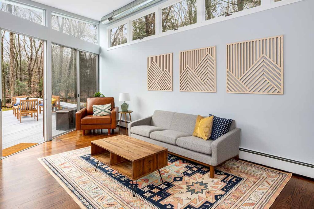
While these colors run the gambit, designers are still seeing a lot of use for light and medium gray, warm neutrals, and muted palettes. No matter where you fall on the color spectrum, changing your interior paint color is a great way to breathe new life into your home. Reach out to us to get started today!